Neville Brody Design
- Perception.Co

- Jul 30, 2025
- 1 min read
Updated: Jan 5
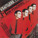
A great influence in my graphic design career and one of the most prominent examples of Russian influence in 1980's graphic design was the work of Neville Brody, designer and art director of The Face magazine. And to this day Brody continues to borrow from the 1930’s Bauhaus School and Russian Constructivist layouts using stark angles, asymmetry and type as image.
His typographic treatments echo Rodchenko’s visual experiments and Lissitzky’s spatial dynamics. Brody’s work isn't mere replication, it's reinterpretation using historical styles to challenge the contemporary norms of corporate modernism.


The influence of Russian art was also evident in the punk and post-punk graphic scene, where designers used Constructivist motifs to convey a sense of urgency, rebellion, and anti-establishment ethos. The DIY aesthetic of punk flyers and zines often mirrored the raw, propagandistic nature of early Soviet posters, repurposing them as tools of cultural dissent.
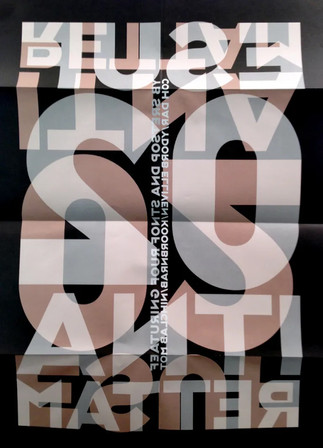
In 1990 he found the FontFont typeface library together with Erik Spiekermann. With FUSE, an interactive magazine and collection of experimental typefaces and posters, he challenges the boundaries between typography and graphic design.
Today, Neville Brody’s work focuses mainly on electronic communications design, and because of his unique and striking digital typefaces, his contributions to the world of graphic design and digital typography are invaluable. As often referred to as a “star typographer”, Brody has designed several very well-known typefaces. Mostly, unique fonts include the updated font for the Times newspaper, Times Modern, New Deal as used in publicity material, and titles for the film Public Enemies and Industria.
